
Euplotes Drug Treatment Experiment!
Introduction
Another great day, guys.
Lately, I’ve been experimenting with going through drug treatments, and it’s been torturous.
The data always turned out poorly and there was always a need to do duplicates, so I wrote a handy plotting script using R.
It helps us to quickly generate plot, observe and analyze the results.
I hope this method will help you too.
Data
Concentration: Different concentrations of drugs.Days: Time after adding drugs.Totals: Every day’s total number of surviving individual.Repeat: Number of replicates for each drug concentration.Times: The number of repetitions of the entire experimental procedure.
Visualization Script
# -*- coding: utf-8 -*-
# @Author    : mengqingyao
# @Email     : 15877464851@163.com
# @Time      : 2024/09/23 10:00

library(R6)
library(tidyverse)
library(ggrepel)
library(ggprism)
library(rstatix)
library(patchwork)

PlottingClass <- R6Class("PlottingClass",
  public = list(
    data = NULL,

    # 初始化函数
    initialize = function(data, var) {
      self$data <- self$factor_reorder(data, var)
    },

    # 因子重排
    factor_reorder = function(data, var) {
      if (!"Concentration" %in% colnames(data)) {
        stop("错误:数据中缺少 'Concentration' 列。")
      }

      if (!is.character(var) || length(var) < 1) {
        stop("错误:var 参数必须是长度大于0的字符向量。")
      }

      if (!all(var %in% unique(data$Concentration))) {
        stop("错误:var 参数中的某些水平在 'Concentration' 列中不存在。")
      }

      data$Concentration <- factor(data$Concentration, levels = var)
      return(data)
    },

    # 设置主题
    set_theme = function() {
      theme_prism() +
        theme(strip.text = element_text(size = 18),
              axis.line = element_line(color = "black", linewidth = 0.4),
              axis.text = element_text(color = "black", size = 15),
              axis.title = element_text(color = "black", size = 20),
              panel.grid.minor = element_blank(),
              panel.grid.major = element_line(linewidth = 0.2, color = "#e5e5e5"))
    },

    # 绘制泡泡图
    bubble = function(title = "Penicillin treatment",
                      fill_color = c("red", "green", "#9ED8DB", "#3498DB")) {
      plot <- ggplot(self$data, aes(x = Days, y = Concentration)) +
        geom_point(aes(colour = Concentration, size = Totals), alpha = .7) +
        geom_text(aes(label = Totals), vjust = -1.1, size = 4, fontface = 'bold') +
        scale_size_continuous(range = c(3, 10)) +
        labs(title = title) +
        guides(colour = 'none', size = 'none') +
        theme(title = element_text(size = 15), plot.title = element_text(hjust = .5),
              axis.text = element_text(color = "black", size = 15),
              axis.title = element_text(color = "black", size = 20)) +
        scale_color_manual(values = fill_color) +  # 使用自定义颜色
        scale_x_continuous(breaks = seq(0, 6, by = 1))

      if ("Times" %in% colnames(self$data)) {
        plot <- plot + facet_grid(Times ~ Repeat, scales = 'free') +
          theme(strip.text.x = element_text(size = 15),
                strip.text.y = element_text(size = 15))
      } else {
        plot <- plot + facet_grid(Repeat, scales = 'free')
      }

      return(plot)
    },

    # 绘制平滑图
    plot_smooth = function(days_col = "Days", concentration_col = "Concentration",
                           totals_col = "Totals", times_col = "Times",
                           fill_color = c("red", "green", "#9ED8DB", "#3498DB")) {
      # 聚合计算均值
      Record_1 <- self$data %>%
        group_by(!!sym(concentration_col), !!sym(days_col)) %>%
        summarise(mean_totals = as.integer(mean(!!sym(totals_col), na.rm = TRUE)), .groups = 'drop')

      best_in_class <- Record_1 %>%
        group_by(!!sym(concentration_col)) %>%
        slice_max(mean_totals, n = 1, with_ties = FALSE) %>%
        distinct(mean_totals, .keep_all = TRUE)

      start <- Record_1 %>%
        filter(!!sym(days_col) == 0)

      n <- length(unique(self$data$Repeat)) * length(unique(self$data$Times))

      plot <- ggplot(Record_1, aes(x = !!sym(days_col), y = mean_totals, color = !!sym(concentration_col))) +
        geom_smooth(aes(linetype = !!sym(concentration_col)), se = TRUE, alpha = .05) +
        geom_point(size = 3, alpha = .8) +
        self$set_theme() +
        scale_x_continuous(breaks = seq(0, 6, by = 1)) +
        geom_label_repel(data = best_in_class, aes(label = mean_totals), show.legend = FALSE) +
        geom_label_repel(data = start, aes(label = mean_totals), show.legend = FALSE) +
        xlab("Days") +
        ylab("Cell numbers") +
        annotate("text", x = 6, y = -15, label = paste("n =", n), colour = "black", fontface = 'bold') +
        scale_color_manual(values = fill_color) +  # 使用自定义颜色
        guides(color = guide_legend(override.aes = list(size = 6))) +
        theme(title = element_text(size = 15),
              plot.title = element_text(hjust = .5),
              legend.position = "top") +
        labs(title = "Growth curve")

      return(plot)
    },

    # 绘制箱线图
    boxplot_pvalue = function(step_increase, day, fill_color = c("red", "green", "#9ED8DB", "#3498DB")) {
      df_p_val <- self$data %>%
        wilcox_test(Totals ~ Concentration, ref.group = "Control") %>%
        adjust_pvalue(p.col = "p", method = "bonferroni") %>%
        add_significance(p.col = "p.adj") %>%
        add_xy_position(step.increase = step_increase)

      Record_1 <- self$data %>% filter(Days == day)

      ggplot(Record_1, aes(x = Concentration, y = Totals)) +
        stat_boxplot(geom = "errorbar", position = position_dodge(width = 0.4), width = 0.4) +
        geom_boxplot(aes(fill = Concentration), position = position_dodge(width = 0.1), outlier.shape = NA) +
        geom_jitter(width = 0.2, shape = 21, color = "grey20", size = 2, fill = "white", stroke = 1, show.legend = FALSE) +
        self$set_theme() +
        ylab("Cell numbers") +
        scale_fill_manual(values = fill_color) +  # 使用自定义颜色
        scale_x_discrete(guide = "prism_bracket") +
        scale_y_continuous(guide = "prism_offset_minor") +
        stat_pvalue_manual(df_p_val, label = "p.adj.signif",
                           label.size = 4,
                           hide.ns = FALSE,
                           bracket.size = 1) +
        theme(title = element_text(size = 15), plot.title = element_text(hjust = .5), legend.position = "none") +
        labs(title = "Growth variation")
    }
  )
)

create_plots <- function(data, concentrations, file_name_prefix, titles,
                         step_increase = 0.12, day = 6, plot_class, color = c("red", "green", "#9ED8DB", "#3498DB")) {
  # 创建绘图对象
  plot <- PlottingClass$new(data, var = concentrations)

  # 生成泡泡图
  bubble_plot <- plot$bubble(title = titles, fill_color = color)
  ggthemr::ggthemr("flat dark")

  # 生成平滑图
  smooth_plot <- plot$plot_smooth(fill_color = color)

  # 运行统计测试并生成箱线图
  box_plot <- plot$boxplot_pvalue(step_increase, day)

  # 保存图片
  if ("Times" %in% colnames(data)) {
    n_times <- length(unique(data$Times))
  } else {
    n_times <- 1
  }

  if (plot_class == "smooth_box") {
    combined_plot <- smooth_plot + box_plot + plot_layout(widths = c(5, 3))
    ggsave(paste0(file_name_prefix, "_smooth_box.pdf"), combined_plot, width = 35, height = 20, units = "cm")
  } else if (plot_class == "bubble_smooth_box") {
    box_plot <- box_plot + coord_flip()
    combined_plot <- bubble_plot / box_plot + plot_layout(heights = c(5, 3))
    ggsave(paste0(file_name_prefix, "_bubble.pdf"), combined_plot, width = 35, height = 25, units = "cm")
    ggsave(paste0(file_name_prefix, "_plot.pdf"), smooth_plot, width = 25, height = 20, units = "cm")
  }

  return(list(bubble_plot = bubble_plot, smooth_plot = smooth_plot, box_plot = box_plot))
}
This script is used to generate the main of the image.
If you wish to use this script more easily, the data format needs to be consistent with the above.
If you can read it, forget I said it.
Please be careful with changes!
Of course you can resize the image.
Usage
# Save the above code in a file and load it.
source("Euplotes_drugs_R6.r")
library(readxl)
# Load the data
DFMO <- read_excel("Record.xlsx", sheet = 'DFMO')
# Example usage
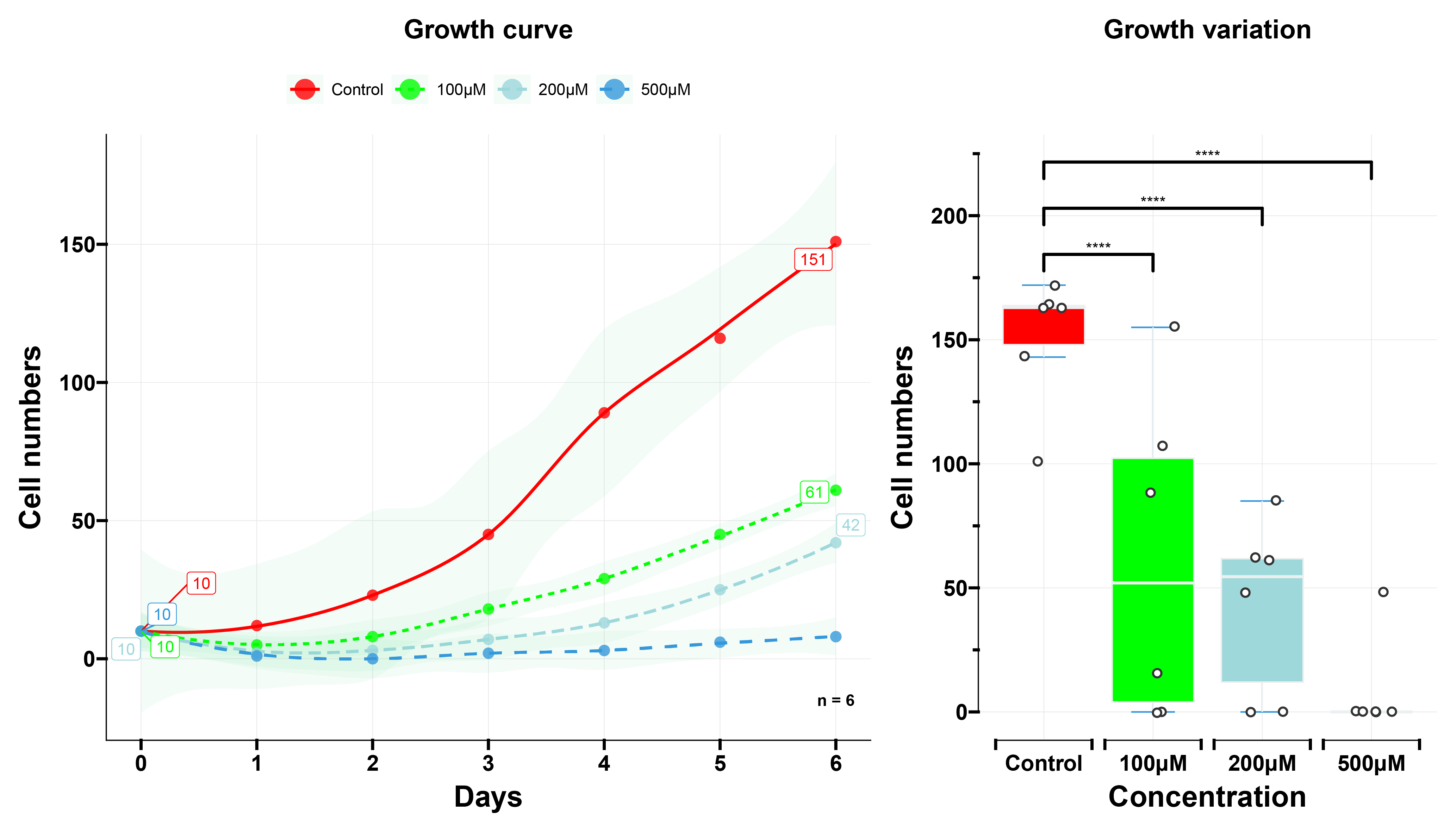
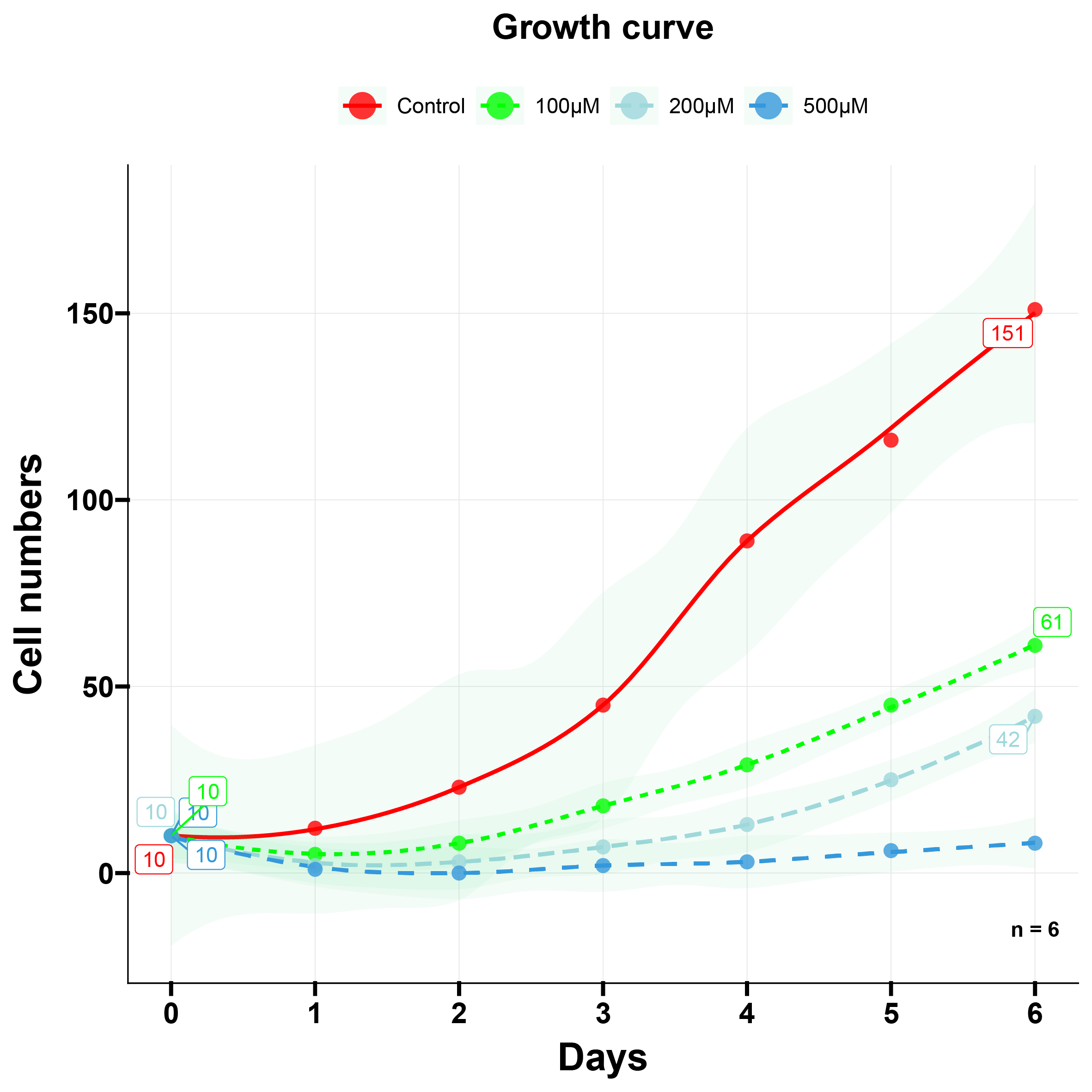
create_plots(DFMO, c("Control", "100μM", "200μM", "500μM"), file_name_prefix = "DFMO", step_increase = .1, titles = "DFMO treatment", plot_class = "smooth_box")Plotted results:
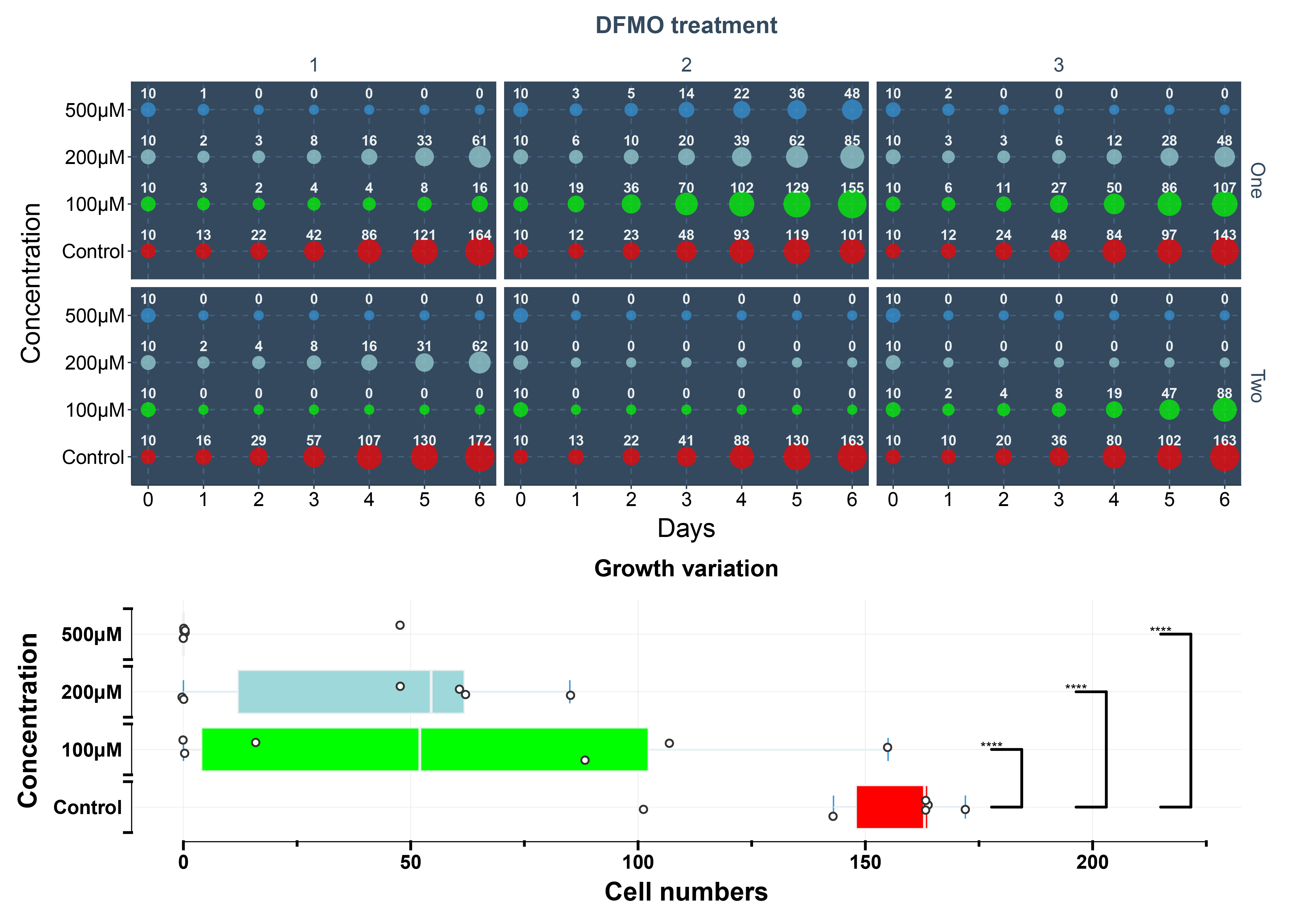
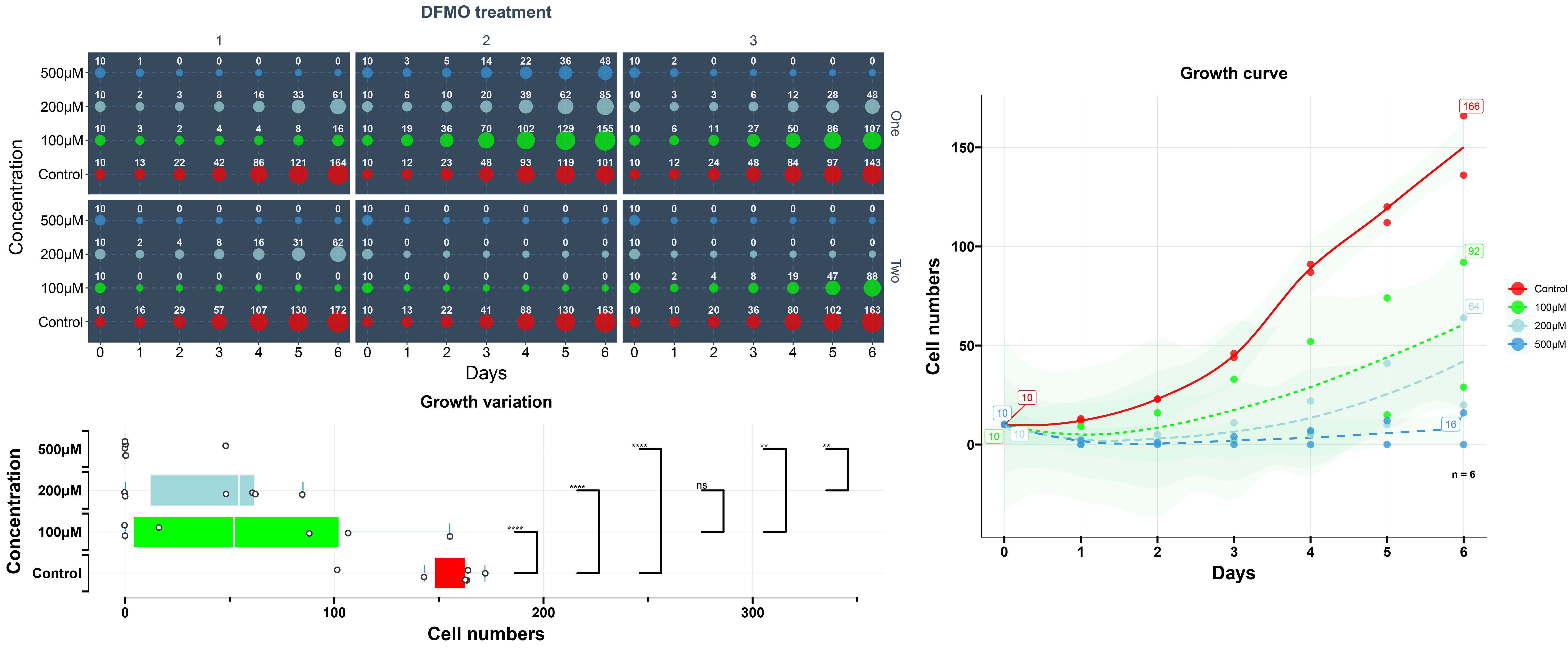
create_plots(DFMO, c("Control", "100μM", "200μM", "500μM"), file_name_prefix = "DFMO_mod", step_increase = .1, titles = "DFMO treatment", plot_class = "bubble_smooth_box")Plotted results:
Beautification
- I would suggest saving the image as a pdf.
- Evolutionary landscaping using Adobe Illustrator.
- Save images as needed.
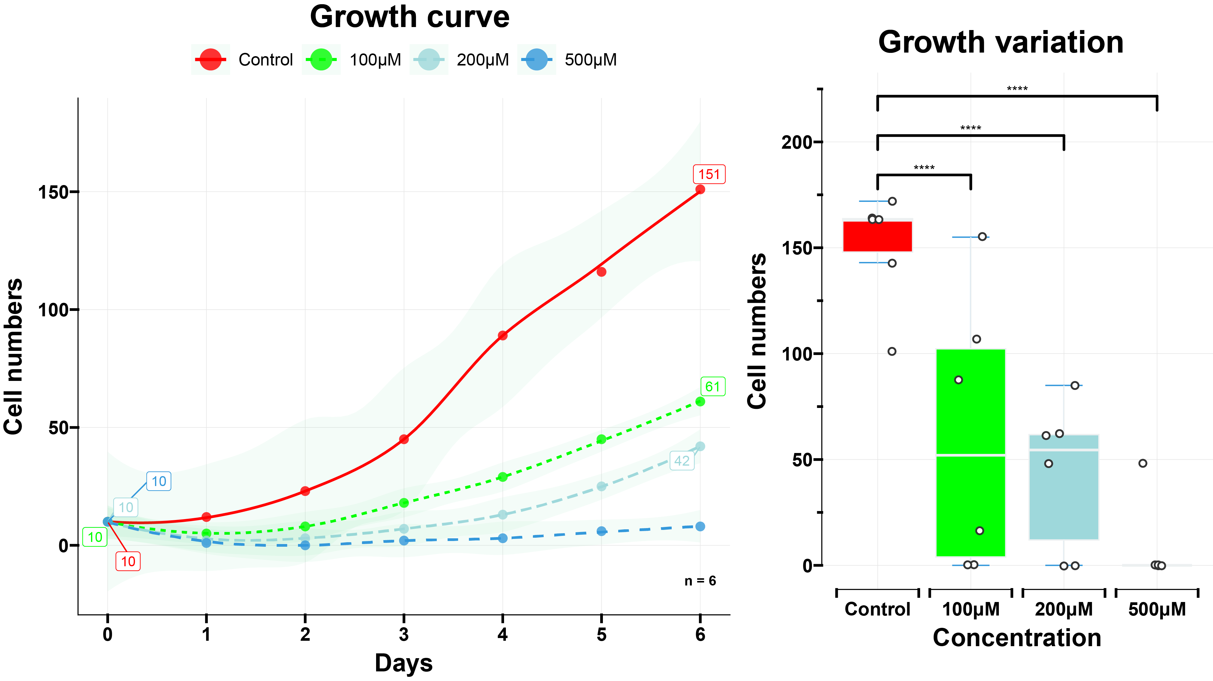
Result
Quote
Email me with more questions! 584338215@qq.com